
Redstart Foods
Responsive website and online ordering for a premade meal delivery service expanding into a brick-and-mortar restaurant.
Scope of Work
UX Research, UX/UI Design, Usability Testing
Tools
Figma, Whimsical, Optimal Workshop
Project Type
Responsive web
Client
Redstart Foods
Domain
Food Industry
Date
October, 2024

Project Overview
Background
Redstart Foods is a successful gourmet premade meal delivery service based in Durham, NC. With its recent expansion into a brick-and-mortar restaurant and bodega, Redstart has outgrown its existing website.
What once served Redstart well is now struggling to accommodate the growing complexity of its business.
Problem
Redstart Foods wants to increase foot traffic and attract more customers to its new restaurant and retail space. However, its online presence is unclear and confusing, obscuring essential information users typically seek when making mealtime decisions.
To address this, Redstart needs a cohesive and user-friendly website that clearly communicates its various services, allowing users to easily select what they need and order or access the information required to utilize those services.
Goals
Provide an intuitive, well-designed web presence for a fast-growing food business representing Redstart’s three primary service offerings: premade meal delivery, catering, and their restaurant/bodega.
Quickly and efficiently provide users with the information they want when making mealtime and meal planning decisions.
How might we present Redstart’s three main services—premade meal delivery, catering, and brick-and-mortar restaurant/bodega—in a clear, concise way that helps users quickly choose, learn about, and patronize those services?

Competitive analysis
User interviews
Affinity mapping

User personas
Goals & problem statements
User journey map
Feature List

User flows
Card sort
Site map
Tree testing
Low-fidelity wireframes
Usability testing

Adjust branding for web accessibility
Component and UI library
High-fidelity wireframes
Prototyping

Usability testing
High priority revisions
Research
I began with an in-depth competitive analysis. Redstart already had a clear idea of their competitors in the premade meal market, but with the goal of increasing foot traffic to their brick-and-mortar, they had done very little investigation into other local businesses with which they were now in competition. I researched several restaurant/cafes in the area and identified several opportunities both for Redstart’s web presence and for the business itself.
Two key opportunities for the website were to:
Simplify the user journey by providing Redstart’s main services upfront.
Rethink the visual hierarchy and informational architecture of the site to provide users with the information they want when they’re ready for it and where they expect to find it.
These improvements would make the ordering process more intuitive and help users find the information they need to make decisions around meal ordering or eating out at a restaurant.
To design this new informational architecture and understand when and where users would seek specific information, I conducted interviews with potential users from the neighborhoods surrounding Redstart’s new location. I spoke with five individuals about their dining decisions, exploring the factors that influence their choices and what might encourage or discourage them from visiting a restaurant.
During these interviews, I also had participants review the existing Redstart website. I asked them to locate information to validate my assumptions about the site’s shortcomings. After gathering the notes from these interviews, I conducted an affinity mapping session to identify common challenges, needs, and patterns among the interviewees.

Key Insights
Potential Redstart customers prioritize value over cost when making decisions about food; they are willing to pay a bit more if the quality justifies the expense
Users want to quickly evaluate healthy options, emphasizing the importance of well-rounded, plant-forward meals. They need clarity on available food items to make informed meal choices.
Many users turn to ordering or dining out due to meal planning or cooking fatigue. They are looking for an experience that feels distinct from what they can create at home.
The website’s current design does not meet these needs. It lacks clear menus, leaving users without insight into cost and quality, and healthy options to choose from. And it obscures essential information like operating hours—critical elements users need for making informed dining decisions.
Define
After collecting the insights from these interviews, I developed user personas to guide the various user journeys I would be designing for. I made two user personas flexible enough to cover all of Redstart’s services.


With a clear understanding of the users and the central problem, I could move on to articulate the goals for this project, weighing the user goals, business goals, and technical considerations.

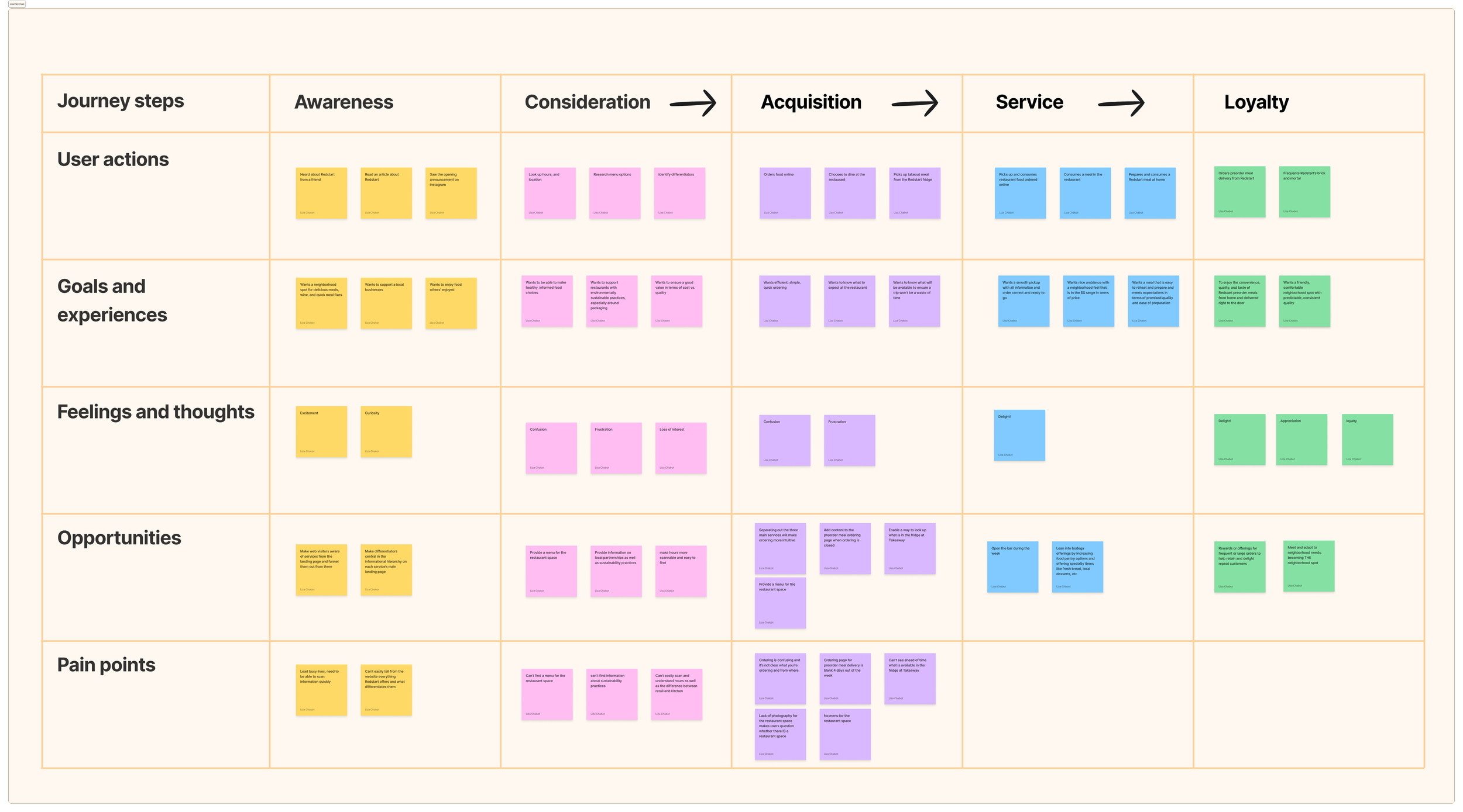
Finally, I developed a user journey map to pinpoint and articulate all the areas of opportunity for enhancing the user experience for Redstart’s customers.
Ideate
Before working on screen layouts or designs, I needed to identify the ideal flows for a user to accomplish their needs and interact with Redstart’s three services. I mapped out three user flows, one for each of Redstart’s services. I also mapped out task flows to make crystal clear what pages would be necessary to support the user flows.

Meanwhile, I conducted a hybrid card sort with nine participants to guide the website’s structure and informational architecture. This process informed my first iteration of the site map, which I then tested with a new group of nine participants. The feedback from this test validated the overall architecture and allowed me to implement minor adjustments before proceeding with low-fidelity layout and screen designs.

The user flows, tasks, and site map enabled me to create a comprehensive list of all the necessary screens for the design. I developed each screen in low-fidelity, concentrating on how users would navigate the site to accomplish their tasks effectively.

Using these screens, I built out a low-fidelity prototype in Figma and conducted usability testing to validate these layouts and flows.
I tested three tasks with five participants. Participants were asked to:
Place a premade meal delivery order
Identify where to place a catering order
Gather information to determine whether to patronize the brick-and-mortar
All participants completed the tasks, verifying my user flows and screens, even at low-fidelity. However, they encountered challenges in certain areas, prompting some key adjustments:
The term “preorder meal delivery,” originally used to describe Redstart’s main service., confused participants and made it difficult for them to identify the service accurately. Based on this feedback, I revised the terminology to “premade meal delivery” for testing in high-fidelity.
Half of the participants found the brick-and-mortar page confusing, particularly struggling with the descriptions fo the various services. In response, I simplified the categories from four (Cafe & Bar, Restaurant, Retail, and Premade Foods) to two (Cafe & Restaurant and Bodega) to test in high-fidelity.
Design
Redstart already had strong branding, but it was primarily designed for packaging and print media, resulting in font choices and sizing that weren’t optimized for web readability. Additionally, the brand colors lacked sufficient contrast to meet accessibility standards, both against their neutral tones and when paired with each other. Furthermore, the color palette primarily featured red and green combinations, which could pose challenges for individuals with color blindness.
To enhance accessibility, I created a brighter white to complement Redstart’s primary greens and introduced a brand black. I opted for a simplified color palette of green, white, and black, ensuring high contrast for accessibility and avoiding problematic combinations for those with color vision deficiencies.
I also made adjustments to font sizing, kerning, and weight to improve readability, and developed UI guidelines for fonts on mobile and desktop.

I designed the high-fidelity wireframes mobile-first, relying on the tone and feel of the current website, while focusing on streamlining flows, tightening up and strengthening CTAs throughout the site, and updating the informational hierarchy for better usability.


Using these high-fidelity wireframes, I developed a prototype in Figma to test three essential user flows:
Ordering a meal from Redstart’s meal service
Navigating to where one would place a catering order
Gleaning information to determine when one can eat at the brick-and-mortar tonight and what one might order

Test
I conducted usability tests with six participants. Tests were conducted in person on a mobile phone or laptop using Otter to record screen interactions and produce a transcript of the conversations. All participants completed three tasks with a 100% success rate:
Ordering a meal from Redstart’s meal service
Navigating to where one would place a catering order
Gleaning information to determine when one can eat at the brick-and-mortar tonight and what one might order
Success Metrics
Achievement rate
100%
Average time on task: Scenario 1
5:41
Average time on task: Scenario 2
:21
Average time on task: Scenario 3
1:23

Testing Insights:
All participants were able to complete the tasks quickly and efficiently
Participants were generally positive about the look and feel of the prototype
Overall, participants described the design as “easy,” “straightforward,” and “intuitive”
Areas for improvement:
Participants noted that delivery times were unclear and requested more reminders throughout the checkout process to clarify how delivery works for this unique service.
The “pay now” button led to a “review and pay” page, failing to meet user expectations.
Participants struggled to understand the meaning of “Fri-Sat” in the listed hours for the restaurant.
Some participants were frustrated by the presence of a “sample menu” instead of an actual menu.
“Everything made sense and did what I expected it to. Very simple, intuitive, and nice to use.”
“Does a great job of making it easy to understand 3 inter-related and complex food services.”
I updated the designs based on test results as follows:
Added reassurance and reminders about delivery throughout the checkout process.
Revised button text to better match the checkout process.
Improved the visual hierarchy and layout on the mobile landing page for the premade meal delivery service to better highlight calls to action and other crucial information.
Incorporated contextual information into the menu to ensure it felt current and accurate to users.
Created new screens to meet business needs, including a “pack-style” modal and a version of the webshop that allows users to browse offerings even when orders are closed.
Conclusion
If given more time, I would conduct user testing with individuals who are unfamiliar with Redstart’s business to ensure the redesigned site effectively communicates and clarifies all of Redstart’s services.
Currently, the prototype represents a significant improvement to Redstart’s web presence, particularly regarding navigation, informational architecture, hierarchy, clear and user-friendly CTAs, accessibility, and overall intuitiveness. It also better integrates the new brick-and-mortar aspect of the business, making it easier for users to find information relevant to that space.
Alongside the final designs, the competitive research, user flows, journey map, personas, and other insights, will provide invaluable direction as Redstart continues to grow and evolve, particularly during the official refresh of its website.
