
Event Canvas
Connecting artists to local arts events for a streamlined participation experience.
Scope of Work
UX Research, UX/UI Design, Branding, Usability Testing
Tools
Figma, Mural, Whimsical, Octopus.do
Project Type
Mobile first website
Client
Personal project
Domain
Event planning & participation
Date
August, 2024

Project Overview
Background
As an artist and former arts event organizer, I initially set out to assist organizers with what I believed would be their biggest challenge: communication on the day of the event.
However, my research uncovered that their primary focus is actually on creating a positive experience for participating artists, changing the project's direction entirely.
Problem
From application to post-event communication, event organizers struggle to create and provide an end-to-end positive experience for participating artists.
This poses a huge problem for organizers; If artists aren’t satisfied with an event, they won’t return, undermining organizers’ efforts to support the very community they are trying to build.
Goals
Provide a seamless, simple, and well-designed experience for artists to easily find, apply to, and participate in collaborative art events.
Enable event organizers to offer a streamlined process for artists looking to participate in their events.
“How might we create a more positive experience for artists seeking to participate in collaborative arts events?”


Research
Curious to learn more about the challenges faced by organizers of collaborative arts events, I sought out local arts event organizers and participating artists, speaking with them in depth about their experiences. This enabled me to…
build empathy with users
develop an understanding of their goals
learn about the pain points preventing them from being successful
get a sense of emerging patterns shared by users
“You want everyone to feel good, like they’ve been attended to, that the information they needed was available, that they had a good time...”
In my initial conception, I hypothesized that event organizers’ biggest challenge would be day-of communication with participating artists and volunteers. However, foundational interviews revealed that arts event organizers’ true priority was the experience of the artists themselves. This insight prompted a shift in focus: instead of providing another event management solution, my project needed to center on the needs of participating artists, enhancing their overall event experience.
As I synthesized my research using an affinity map, I paid particular attention to the pain points artists encountered during these events.
What prevented them from having a positive experience?
What obstacles prevented them from achieving the goals that motivated their participation in the first place?
Key Insights
Collaborative arts event organizers’ primary concern is that their participating artists have a good experience, furthering their mission of building and supporting a strong arts community
There are four key problem areas preventing artists from having a positive event participation experience:
Application process
Fee payment
Finding and having access to up-to-date event information
Poor communication

Define
After collecting and collating all the information from my interviews, I developed user personas. Any solution I was working towards would have two users, organizers and artists. I needed to keep their goals and challenges distinct. Their needs would define and shape what I was to design and their challenges would determine the problems I was trying to solve.
Creating user personas ensured I had articulated both users' goals and challenges clearly and succinctly, keeping them front and center as I moved forward in the design process.


Once my users’ needs and challenges were clearly articulated, I developed a list of features that would address these needs, using the artist persona as my primary user.

Ideate
Before working on the site structure or pages, I needed to map out exactly what my users would be trying to accomplish. For these user flows, I focused on two key pain points for artists:
applying to participate in an event
finding information about an event in which they are participating in one, centralized place.


From my user flows came a sense of the site structure, an event listings site that would enable artists to search for, find, apply to, and look up information for participating in local arts events.
Once the idea of a listings site emerged, I began to understand where certain information and interactions should be on the site. I used a tool called Octopus, which enabled me to get very specific about what information would be available to users as they moved through the site and user flows. This process also determined what screens I would need to design for to support the central user flows.
With that list in hand, I moved on to designing the layout. I drew initial sketches for both mobile and desktop for all necessary screens in the two main user flows. For the layout and format I drew inspiration from other well-designed listing sites, especially Zillow and Airbnb.


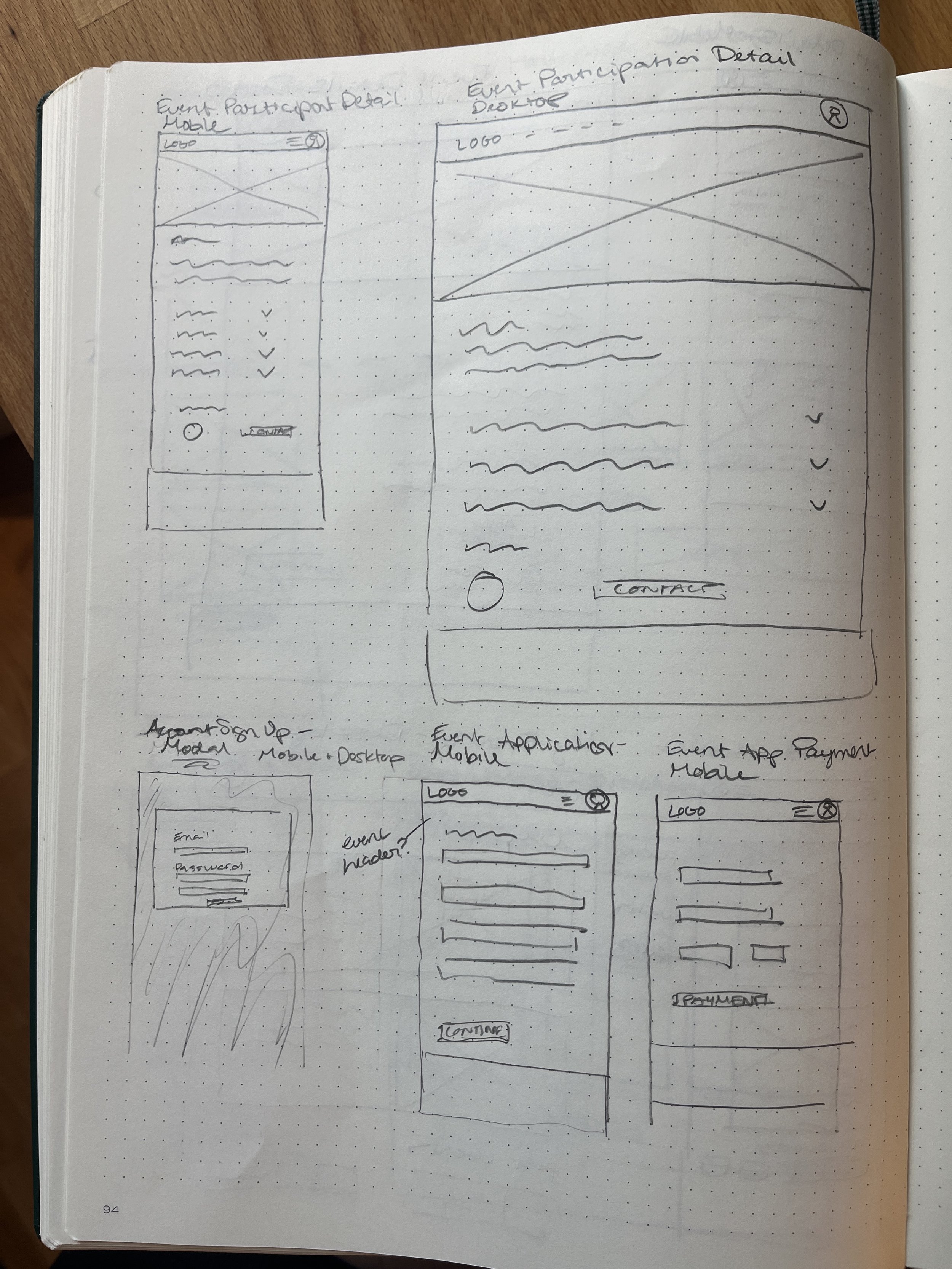

To confirm these layouts made sense, felt familiar to users, and provided information and actions at the right point in my user flows, I brought them to slightly higher fidelity and used these mid-fidelity wireframes to gather feedback.


Design
With solid user flows and a clear structure and layout in place for the proposed screens, it was time to give Event Canvas a unique and vibrant brand that would appeal to the arts community that was its intended audience.
Personability
Creativity
Connection
Energy
The inspiration for the brand design came from words that emerged across my user interviews, especially personability and connection.
Since the site was meant to appeal to artists, it needed to feel vibrant, fun, bursting with creative energy.
Focusing on accessible design, I picked bold colors that met accessibility standards while being appealing and inviting. I chose playful, fat, round fonts that paired well and met readability standards on mobile and desktop devices.
The logo was inspired by an artist's palette and brush textures. I abstractly incorporated these elements with a playful, modern boldness avoiding a literal representation.


Next, I designed all the necessary components and created high-fidelity wireframes. At this point, I realized I needed to create an additional set of key screens to test a third user flow that would address a major pain point for my users.
In my interviews, many artists expressed the difficulty of tracking event changes due to poor communication and organizers’ reliance on printed materials. If the site was truly going to meet users’ needs, it would need to provide a notification system that would alert artists to any changes in the events they were registered to participate in.


Using the high-fidelity wireframes, I developed a prototype in Figma to test three essential user flows:
Finding and applying to an event
Finding participant information about an event
Finding updated event information

Test
I conducted usability tests with 5 participants. Tests were conducted in person on a mobile phone. All participants completed three tasks with a 100% success rate:
Finding and applying to an event
Finding participant information about an event
Finding updated event information
Success Metrics
Achievement rate
100%
Backwards navigations
0
Average time on task: Scenario 1
3:33
:36
Average time on task: Scenarios 2 & 3
“What I wanted to do was easy to figure out how to do”
Testing Insights:
All participants were able to complete the tasks without error
Participants were overwhelmingly positive; they especially liked
event details pages
the ability to edit their applications
the ease of having everything to participate in an event in one place
Several participants mentioned that the site felt “familiar” and “easy.”
Areas for improvement:
Though participants appreciated the lack of unnecessary elements and information in the design, most wanted access to information earlier in the first flow, before deciding to apply for the event.
Participants also said they would feel more reassured if there were additional reminders or confirmations of which event they were applying to and how much it cost throughout the application process, rather than just at the end.
Finally, 2/5 participants expressed the need for guidance around the portfolio upload, i.e. how many images to provide, what format they should be in, etc.
I updated the designs based on testing feedback. I focused on providing information earlier in the user flows, reassurance throughout the application process, and additional guidance on the portfolio file upload.


Conclusion
A passion for the local arts community and curiosity around how to ease participation in arts events drove me to pursue this project.
The design process enabled me to create a prototype users found useful and enjoyable, the response to which was overwhelmingly positive.
If given the chance to bring this prototype to life, my next step would be to conduct research around the search and filter functions, ensuring these central tools served user needs. Eventually this site could incorporate a social component as well, helping artists network and build community in the arts.
